Origin Energy
Senior Product Designer · 2024
Energy ‘sign-up’ and ‘moving home’ journeys
I led the redesign of Origin’s energy ‘sign-up’ and ‘moving home’ journeys by replacing long, cognitively demanding forms with optimised and personalised journeys so that more customers could complete a move online.
Summary
Context
Origin’s market share in the energy sector was slipping with only 27% of home-move sign-ups being completed online. A poor online expereience was also driving 8000+ move-related calls a month. I led the redesign to make the digital channel the primary way customers move home.
What I did
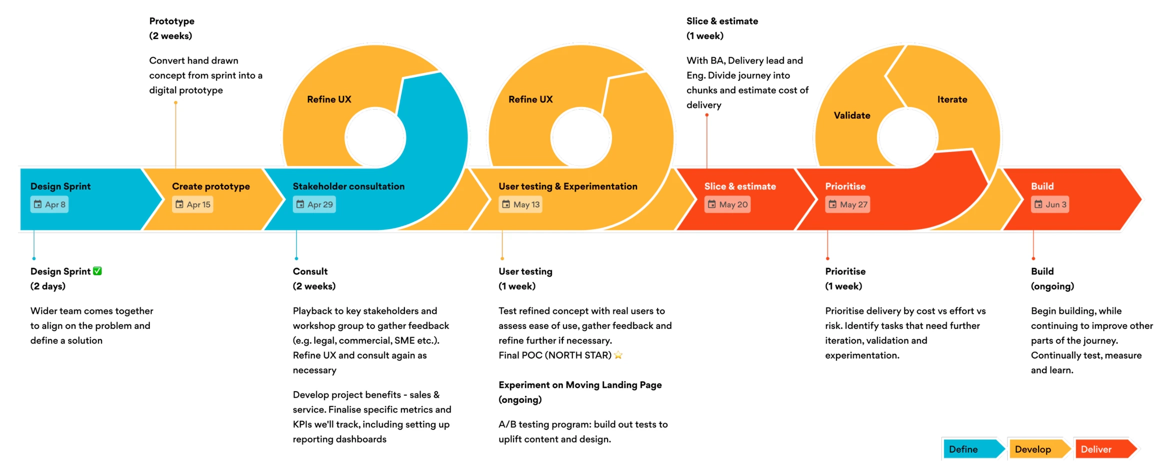
I ran a Design Sprint with all of my cross-functional team which defined the pre- and post-purchase customer problems, and prototyped and user-tested a simpler journey which utilised a staged disclosure model and drastically reduced the time and cognitive load required by customers to complete the sales journey.
Result
The redesign replaced the long forms with a scalable, personalised and branded journey validated through usability testing and unmoderated A/B tests. This helped us meet the teams goals of higher sales conversion, a reduction in call centre volumes and my workshop approach was recognised when the CMO invited me to teach 80 marketers to facilitate their own design sprints.
Business Opportunity
Origin’s market share was declining, sitting at 25% for electricity and 26% for gas, in a market where 1.14 million households (12% of all Australian households) move home every year. Move events account for 64% of Origin’s overall sales performance, yet only around 27% of move-ins were completed online, and 45% of the customers phoning us to book a move were already digitally engaged. This was resulting in high call volumes and therefore cost in customer support, which answered around 8000 move-related calls a month.
Cross-funtional Stakeholders
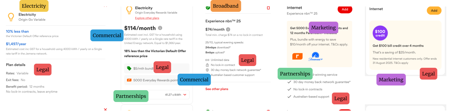
Each of our stakeholders also had requirements and goals and so I audited other journeys alongside our own so that any improvements would be as scalable and reusable as possible, and looked for touch-points where other products and services are cross-sold. I identified and collaborated with business-unit owners to understand the impacts and trade-offs, and made sure everything got Legal and Compliance approval.
Design Sprint
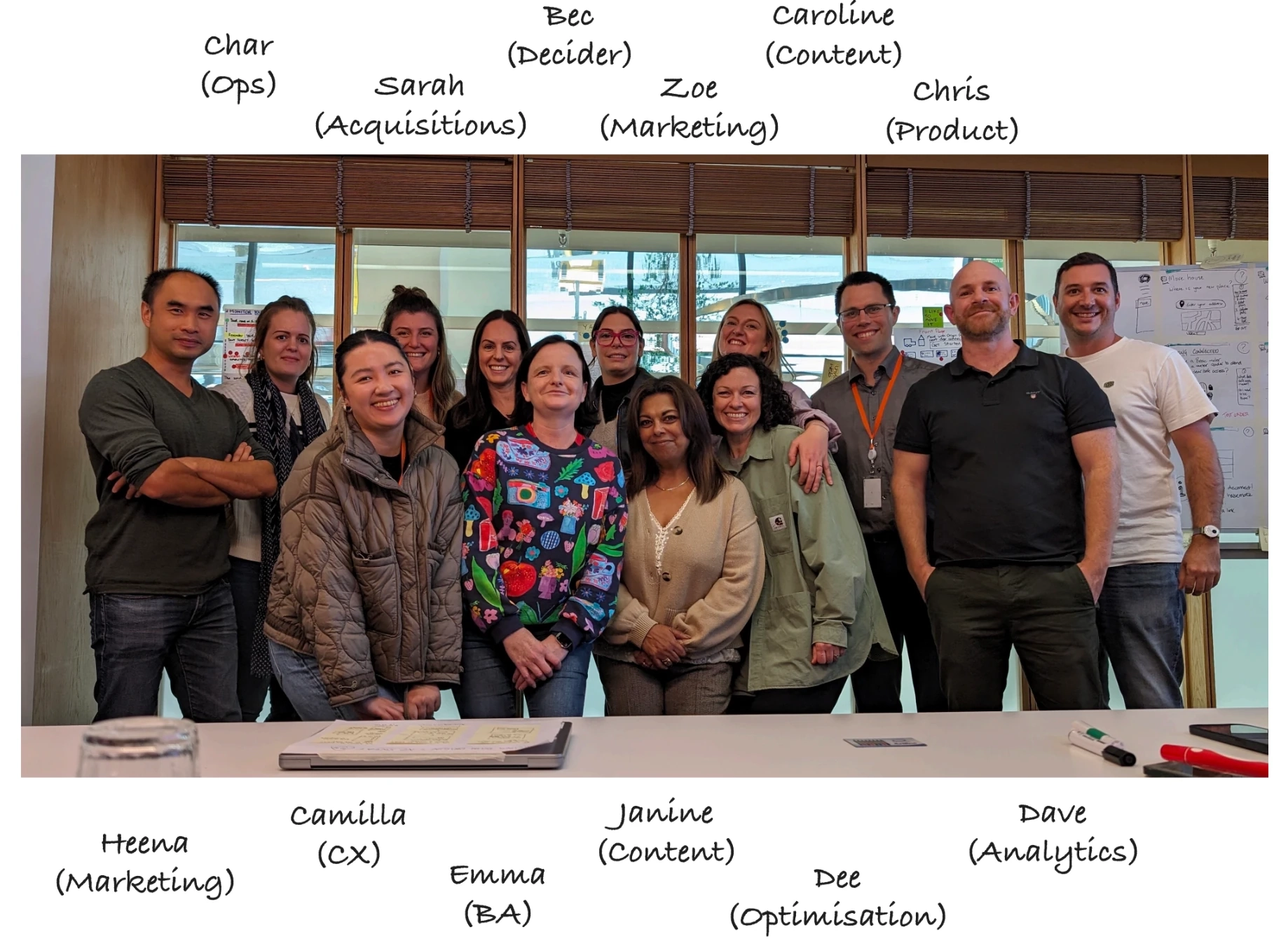
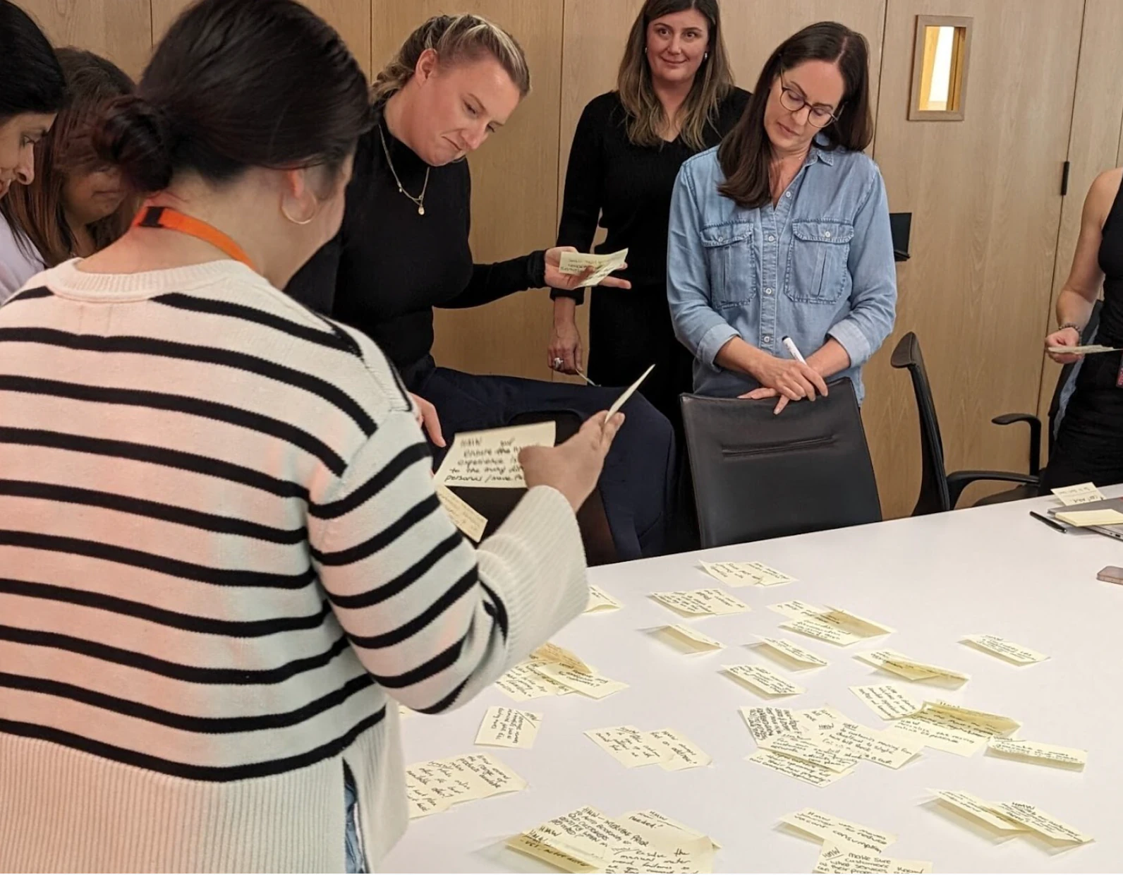
In my first month at Origin, with the aim to further boost cross-funtional alignment and collaboration, I organised and facilitated a 1-week, in-person design sprint following the Design Thinking double diamond. As a diplomatic, cross-functional process, it not only built shared understanding, empathy and alignment across the team, made room for healthy debate, but also produced genuinely innovative solutions.
The Problems We Identified
Sign up journey (pre-purchase)
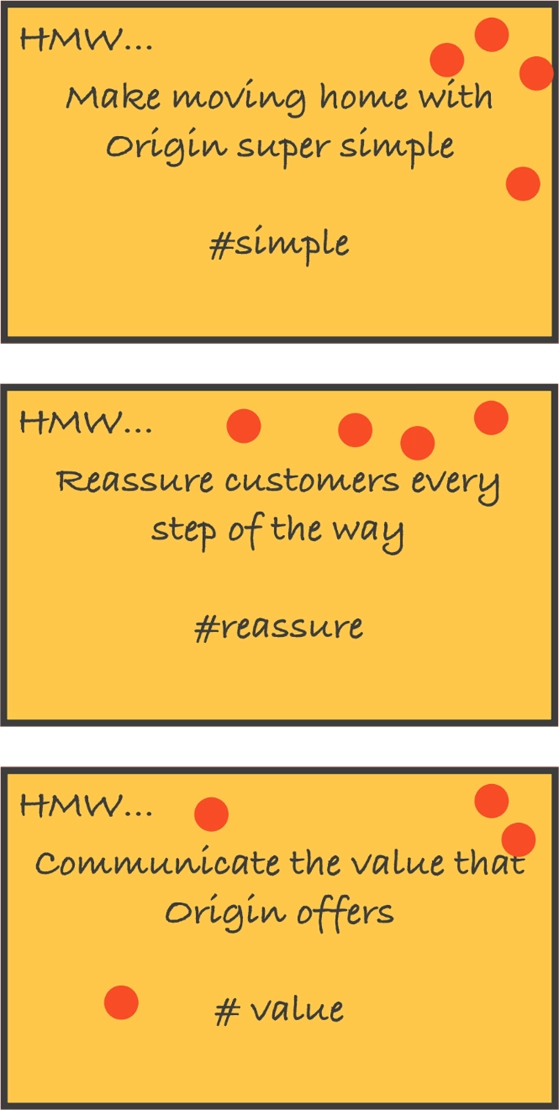
On the sign-up journey, before purchase, the forms were long and cognitively demanding, conversion was low, and the whole thing was hard to complete online.
Setting up (post-purchase)
After purchase, ongoin communication was poor and many calls were related to a lack of understanding of what to expect and when. Simply understanding when customers could expect to have their services connected could lead to a huge reduction in call centre traffic.
Unfair advantage we could leverage
Working in our favour were three advantages we could lean on. Origin's brand reputation, customer loyalty, and bonus offers and parternships.
Prototypes
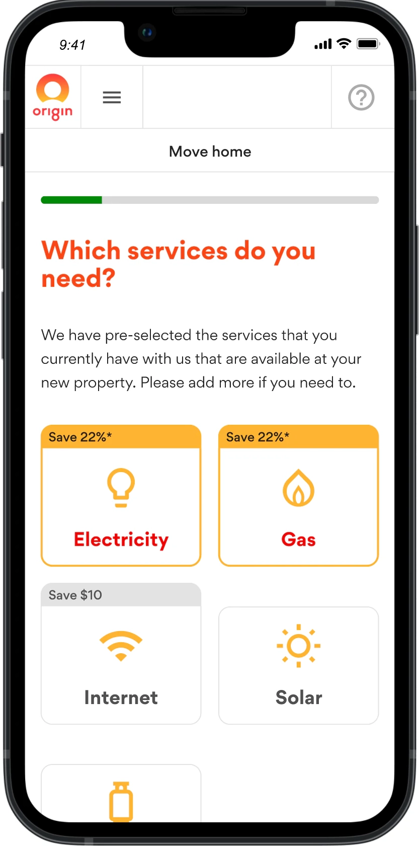
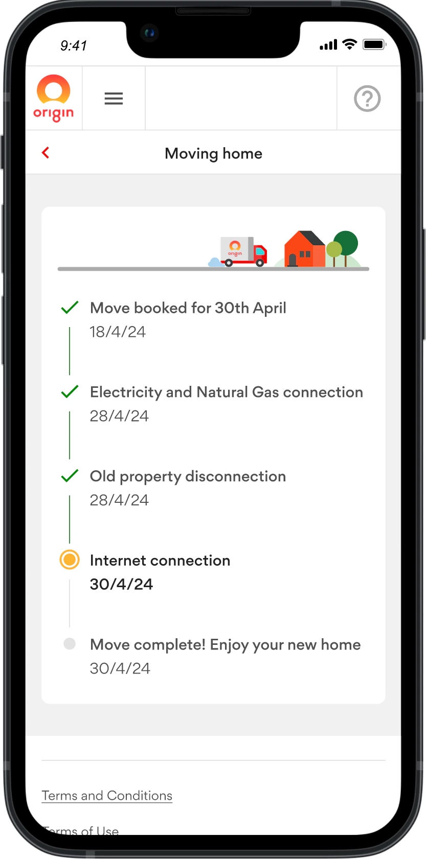
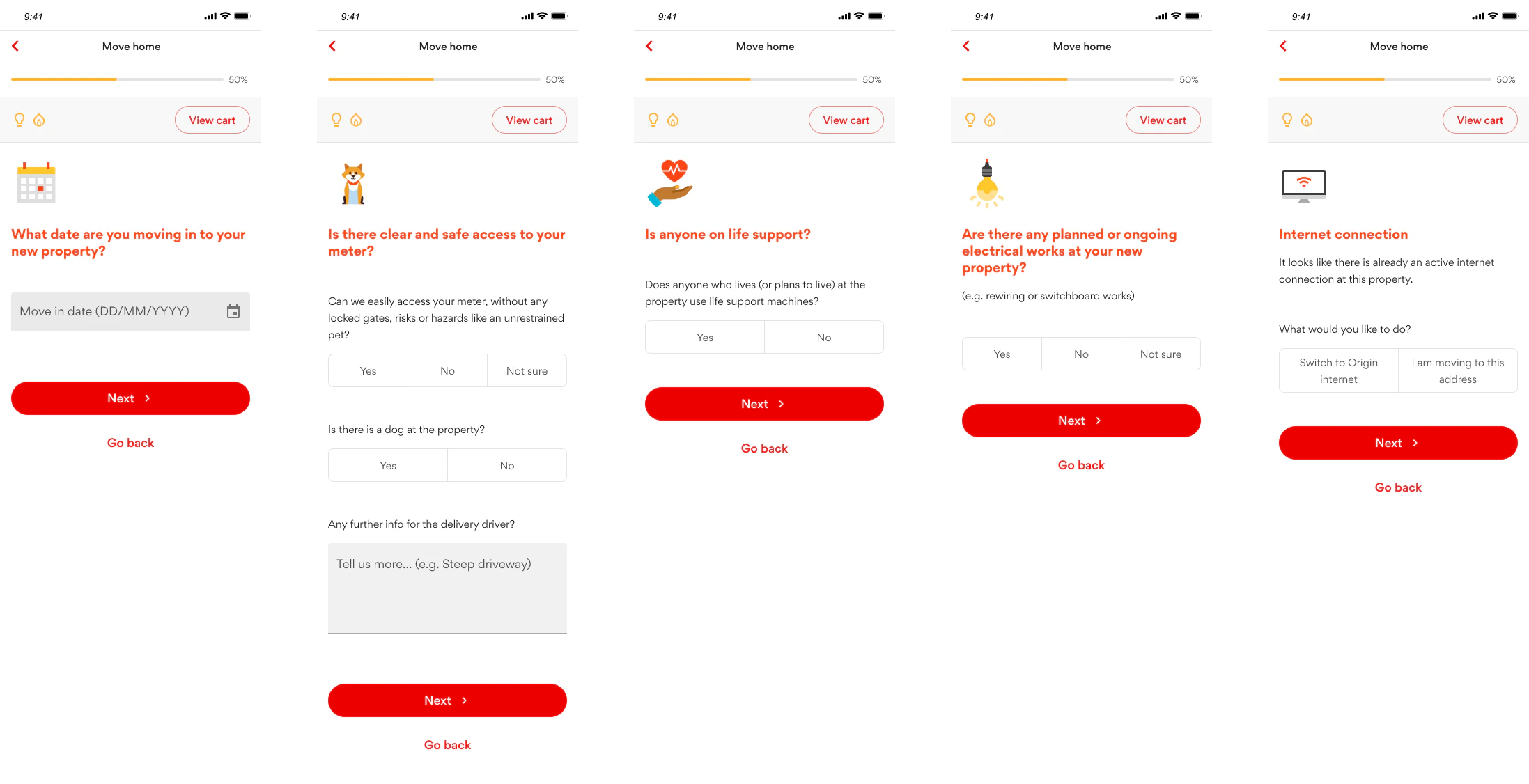
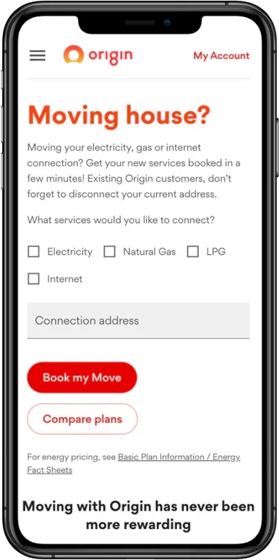
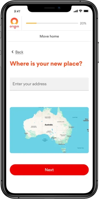
I then created prototyps and tested our new key concepts. Breaking down the long signup forms into individual steps and including a progress indicator made the journey feel shorter, and a simple service selector made it easier to navigate. We communicated the value of adding multiple products, added a post-sign-up timeline view so customers no longer had to call, brought in more brand personality, and made it easy to understand what to expect and when.
Usability Testing & Recommendations
Overall the prototype was a success – participants were able to complete all of the tasks they were given. However, there were several friction points that could be improved:
- Be clearer about the discounts available from the beginning of the journey, including any potential additional benefits that may be included.
- Provide more information about what is meant by ‘clear and safe access’.
- Pull through Direct Debit details from the previous plan.
- Redesign the ‘Disconnect’ page to help people simply define when they want to stop paying for services at their old property.
- Include the dates customers can expect to receive their last bill from their previous property and their first bill from the next.
- If there is an error with their meter read, give customers feedback on what the problem was and how to prevent it happening again.
- Make the ‘in progress’ icon on the tracker look less like the step has already been completed.
We also uncovered opportunities worth exploring further:
- All four participants said they would compare the defaults shown against other plans, so we should explore ways to let them do this without leaving the move journey.
- Explore ways to provide more accurate prices based on past usage and individual circumstances, rather than generic monthly rates.
Before - looooong forms
The starting point was long, intimidating forms with little brand personality and inconsistent UI components and because the pages were hard to make dynamic, they were hard to maintain too and had to be duplicated for the multiple combinations of products available.
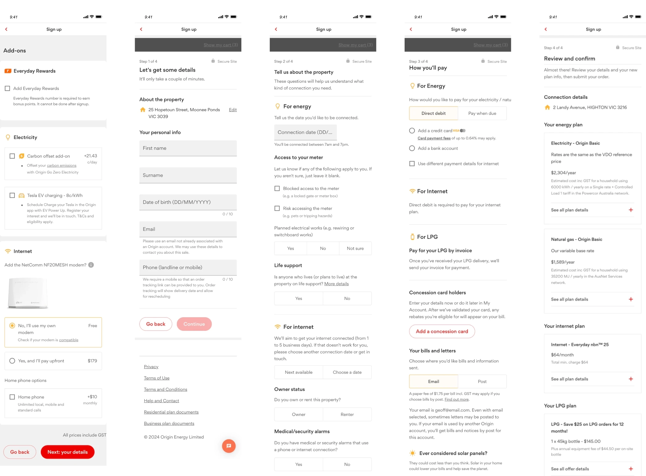
After - staged disclosure
The redesign utilised a staged disclosure architecture with questions asked one at a time and separated onto individual pages. Informative iconography also made use of the brand’s personality and a progress indicator showed people where they were in the overall signup journey. Overall, an atomic-design approach of repeatable components and templates made the journeys easy to scale and maintain, while creating consistency across the end-to-end journey.
Unmoderated AB Tests
To help validate that the new architecture and journey was actually going to work before we built it for real, I ran an unmoderated A/B test, comparing the existing journey (A) against the new design (B). The new design won across every key metric, although I also made it clear that this was a test conducted in controlled conditions, so these statistics are not necessarily indicative of real-world results...
| Existing (A) | New (B) | |
|---|---|---|
| Single Ease Question (average) | 5.7 | 6.75 |
| Thought concept was easier | 1 | 14 |
| Perceived time on task (average) | 5.45 | 6.3 |
| Thought concept was quicker | 3 | 13 |
| Actual time on task (average mm:ss) | 05:28 | 04:30 |
| Were quicker | 6 | 14 |
Reflection & Challenges
The constant challenges were keeping momentum and excitement alive – reminding people of the potential – and fighting for scope. What worked was inviting people in at the beginning to create ownership and drive motivation, bringing Legal & Compliance into the team and asking for their help to design the experience, and working closely with the Head of Digital and Principal Delivery, which mattered most of all.
It was my last project at Origin, and a fitting one to end on: the CMO invited me to teach 80 people in marketing how to facilitate their own design sprints. ☺️