HotDoc
Senior Product Designer · 2025
Virtual care patient & practitioner experiences
I led the design of HotDoc’s ‘Virtual Care’ patient booking experience. Our goal was to improve access to Telehealth services in order to give patients access to healthcare who would otherwise find it challenging. This would also relieve some of the pressure on overbooked in-person GP appointments.
Summary
Context
As the first designer embedded in HotDoc’s Virtual Care team, I was tasked with growing the ‘Telehealth On Demand’ booking experience by increasing both flow starts and conversion, improving access to telehealth and relieving pressure on overbooked in-person GPs.
What I did
I led the research and design from end-to-end by interviewing patients, studying analytics and competitor analysis, uncovering the pateints mental models and jobs-to-be-done, redesigning the booking home page, and validating each change through a series of A/B experiments.
Result
The winning variants of the experiments lifted Telehealth On Demand flow starts by up to 95.5% and conversion by 4.4%, adding thousands of bookings to the platform each month and a projected $2.2m in annual revenue for the business, which contributed to HotDoc reaching profitability and a $200m valuation.
Context
HotDoc is twelve years old but only became profitable in 2025. I was part of the ‘Virtual Care’ team, whose job it was to match patients with doctors via Telehealth, relieve the pressure on overbooked in-person doctors, and extend healthcare to people who struggle to access it (i.e. those who live remotely or are less mobile.)
The ‘Virtual Care’ team had only launched three months before I joined, and there had never been a designer embedded in it before me. The team consisted of 1 designer (me), 6 engineers, 1 data analyst and 1 product manager.
Team Goals
Our primary goals were to increase ‘Telehealth On Demand’ flow starts, lift conversion from 11.5% to 18%, drive repeat bookings, and raise patient reviews from 3.6 to 4.0. Secondary to those, we wanted to grow net bookings across both in-person and virtual care and shorten the time it took to complete a booking. We also used cannibalisation as our guardrail metric to ensure we were actually growing the product and weren't simply redirecting existing patients from one part of the app to another.
Research
I used a variety of research menthods, both quant and qual, to understand where we were today and what needed to change. On the quantitative side I used analytics and A/B testing which told us what was happening and on the qualitative side I interviewed patients and dpractitioners, gathered CX feedback and conducted competitor analysis which told us why.
Methods and skills used:

Interviewing

Analytics

AB Testing

Competitor Analysis
Patient Interviews & CX Feedback
The interviews and CX feedback painted a consistent picture of confusion and friction. Patients struggled to find the right appointment (or even to locate Telehealth at all, in some cases) and got lost in unclear navigation and jargon like ‘Care Team’ that they didn’t recognise. Continuity of care was also recurring worry for both practitioners and patients and people were concerned about booking a telehealth appointment with their usual GP only to be seen by someone different, or didn’t remember the doctor the app had assigned them.
The flow also surfaced things that didn’t apply to them (e.g. “I don’t have a psychologist, why does it want me to add that?”) while hiding the things that mattered. Several people only discovered the price after filling out the entire form. Others couldn’t find a way to get a repeat script, and some were confused by promotion of services HotDoc didn’t even offer, like dentists. Underneath all of it sat a trust problem driven by the dated look and feel: “Something about this app just doesn’t look right. I’m not sure I’d trust it with my data.”
Analytics
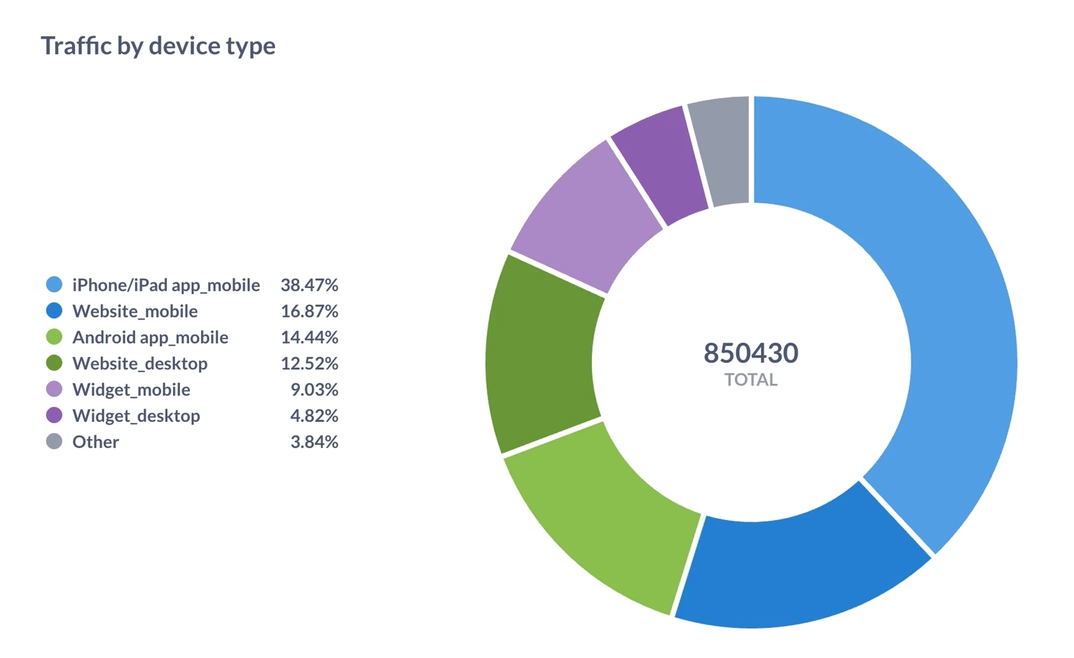
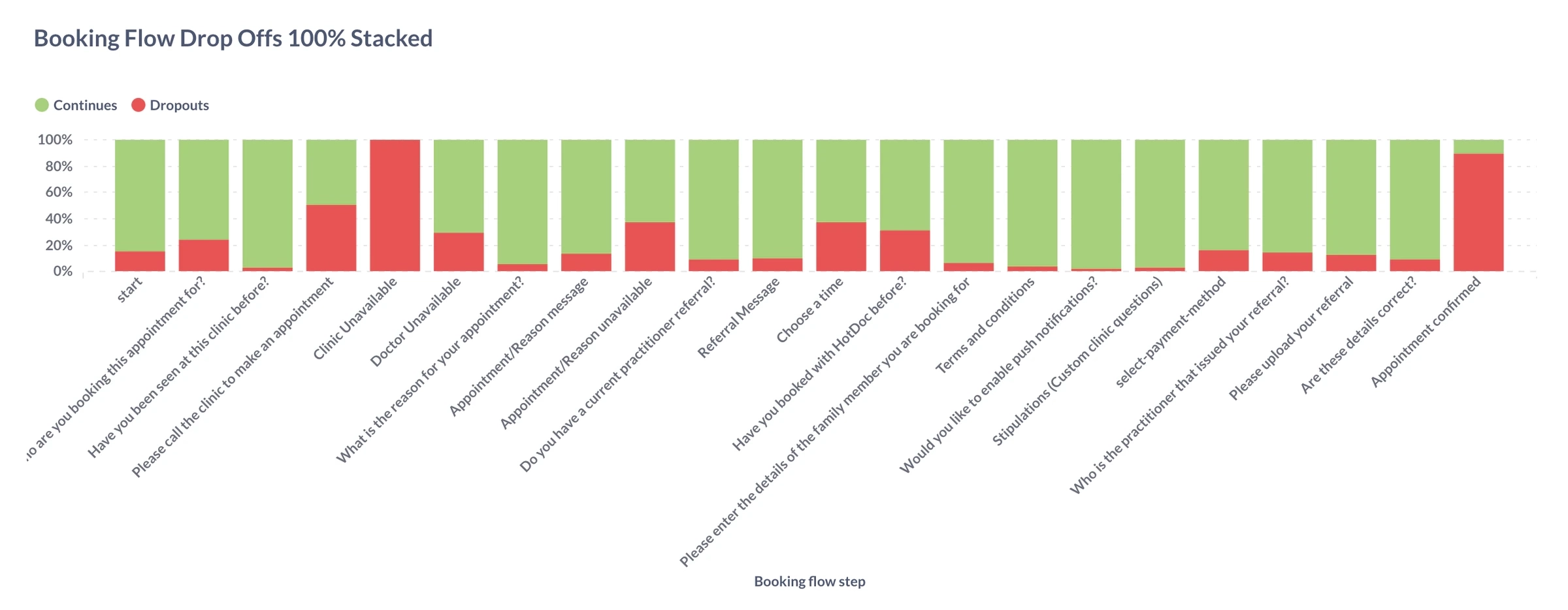
We then found data that reinforced what we learned in the interviews. In additin we discovered that more than 80% of bookings are made on mobile devices, and 69% come from existing patients. We also found from our analytics that a lack of availability was the single biggest reason patients failed to complete a booking, while CX feedback told us that a misunderstanding of what could actually be achieved by Telehealth was the number-one driver of refund requests.
Competitor Analysis
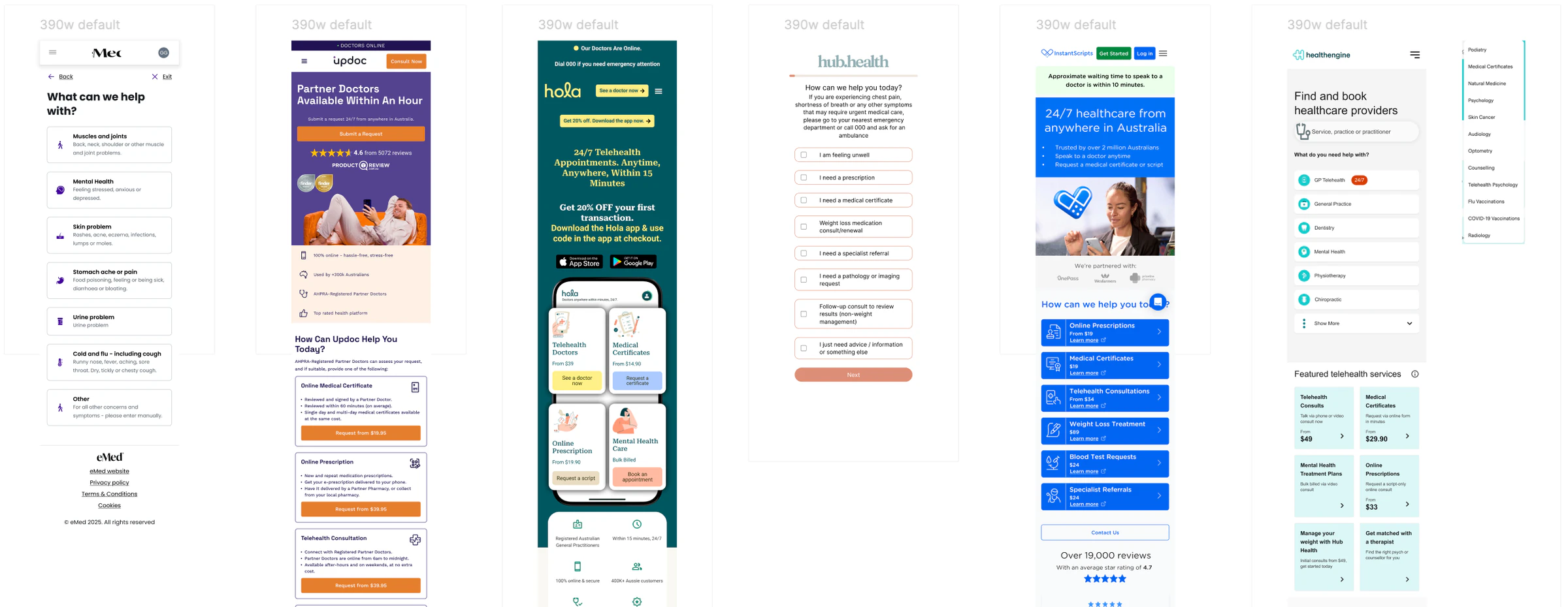
Looking at competitors surfaced the patterns worth borrowing (there is rarely any point in reinventing the wheel). This included shortcuts for the most common appointment types, clear doctor availability and wait times, and prices shown up front. The best experiences catered for several mental models at once, and understood a patient’s need before offering solutions, rather than showing them everything at once and relying on them to work it out.
Scope and Constraints
There were also several feasibility and viability constraints that shaped the direction of the designs. Large changes meant lengthy native app releases, there was no design system and little in the way of branding or visual identity, and we still had to serve the needs of our business customers alongside patients.
To learn from our experiments quickly, we kept the scope of each one small. This included no changes to the search architecture, and a focus on the Home Page alone for this early phase.
UX Design
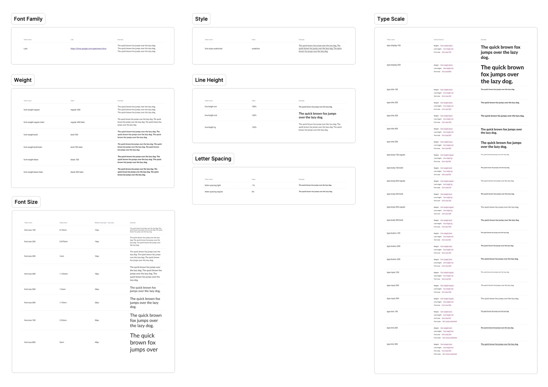
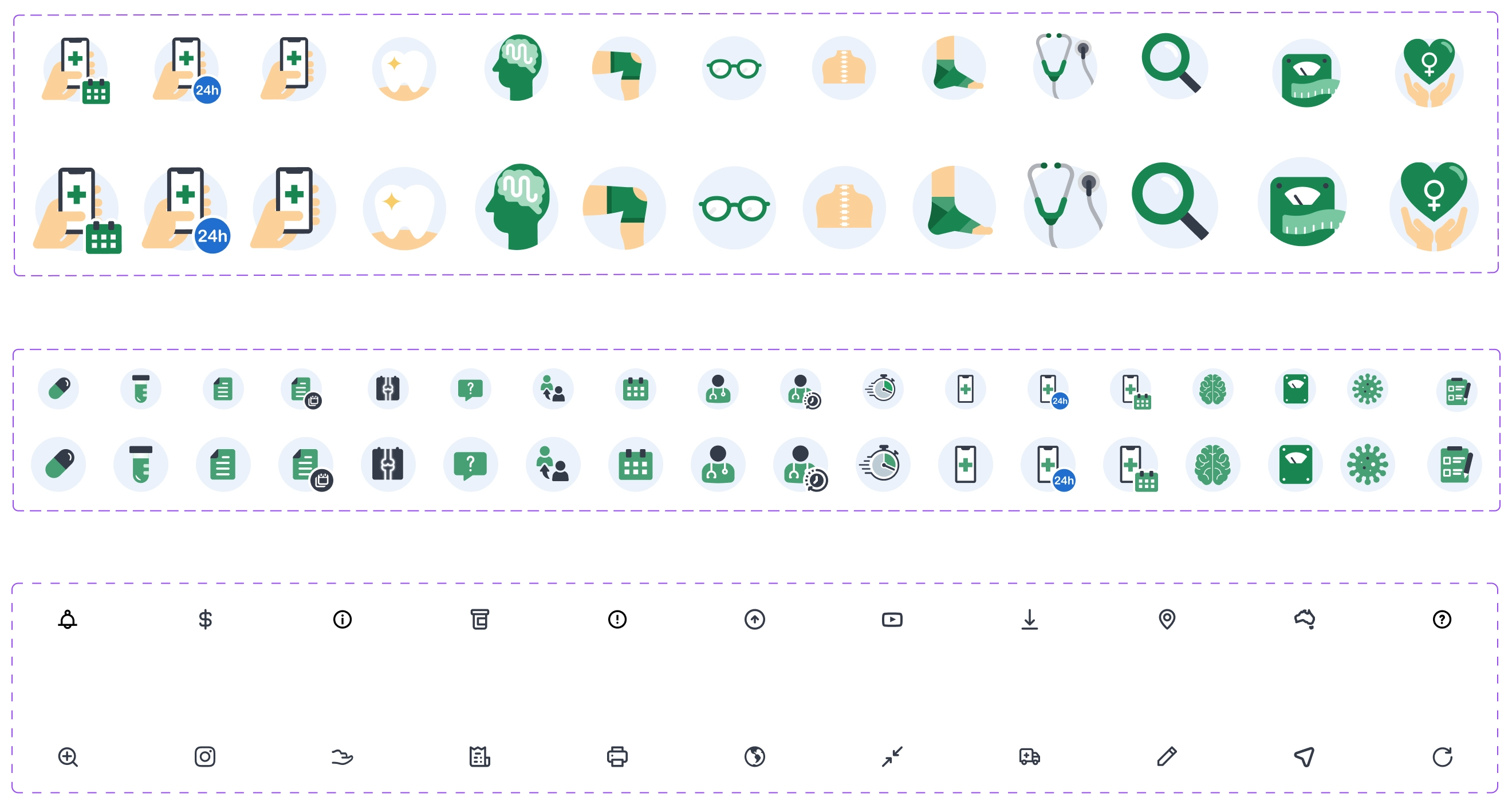
The existing UI had arbitrary spacing, random border radii, no font hierarchy, and inconsistent use of shadow and iconography. I brought it into order with an 8px grid, nested and scaled border radii, and a new type scale to create hierarchy. Content was spaced and grouped using the Law of Common Region, colours were also used to highlight key information and group services by category, and the whole thing became a flat UI on a white background, supported by a new primary, secondary and tertiary icon family.
Methods and skills used:

Journey Mapping

Information Architecture

Wireframing

UI Design

Prototyping
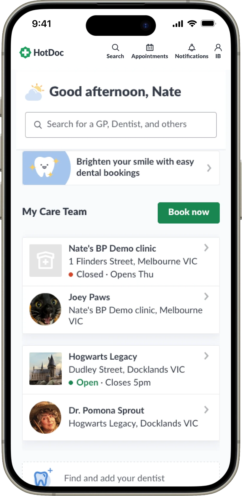
Before
The starting point was a confusing interface that was hard to navigate and missing crucial information. It catered for only one mental model, the UI was dated, and its aesthetics actively undermined patients’ trust in the app’s security.
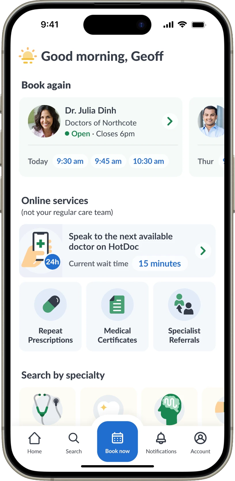
After
The holistic end state I designed towards and tested surfaced all the methods and lets the patient choose, rather than promoting one over another. Crucially, it caters for the different mental models people bring to booking - who they want to see, when, how, and what for.
A/B Experiments
The three key experiments that we launched were a great success!
-
Hypotheis: Add 'next availability' information to both
doctor cards and telehealth services will give patients the
information they need to feel confident in getting an
appointment in the near future.
Results: Telehealth On Demand flow starts increased 53%, worth an extra 2,518 bookings a month. -
Hypotheis:Bringing greater attention the 'Telehealth On
Demand' tile and also being more specific about availabiliyt
of appointments and wait times will increase flowstarts even
further.
Results: This improved conversion by 4.4%, adding 753 bookings a month. -
Hypotheis: Adding price infomration alongside each
appointment type up front will give patients the info the need
to start a booking and increase flow starts and conversion
Results: This drove flow starts up by a staggering 95.5%, the equivelent of an additional 5,497 bookings every month.
Methods and skills used:
AB Testing
Data Analysis
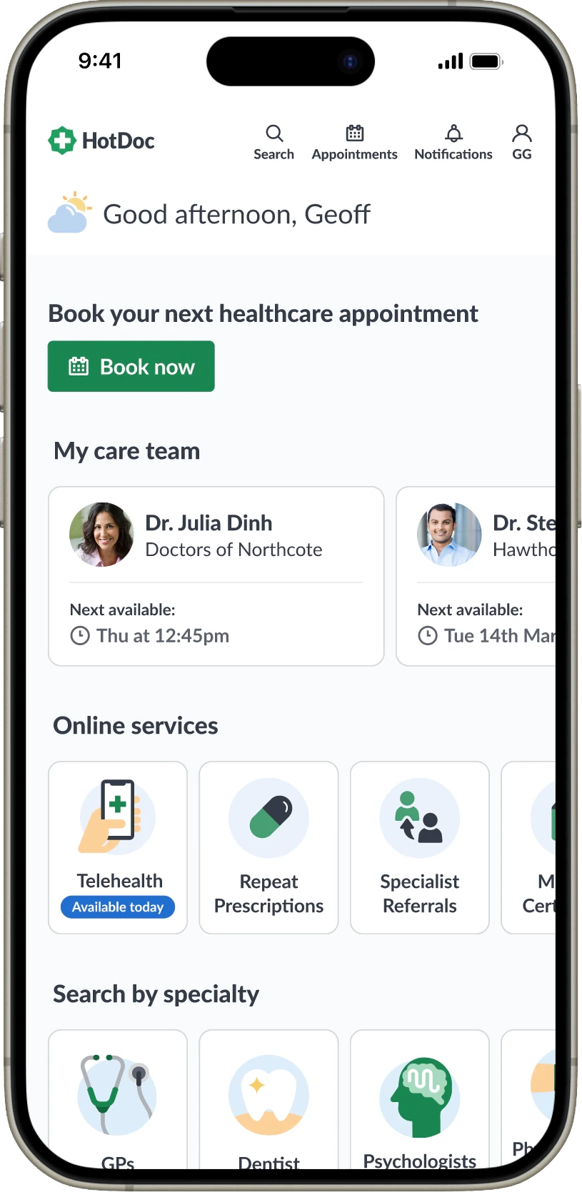
TOD Flow Starts: +53%
Bookings: +2518/month
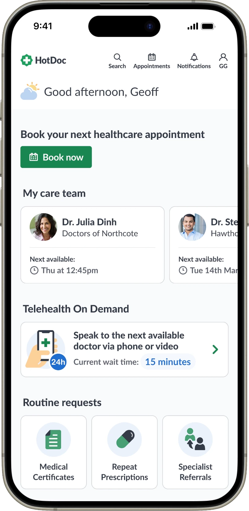
TOD CR%: +4.4%
Bookings: +753/month
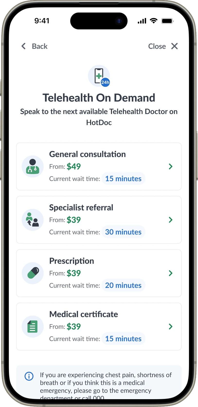
TOD Flow Starts: +95.5%
Bookings: +5497/month
Impact & Results
HotDoc is now profitable and recently received a valuation of $200m. The three designs from the A/B test experiments alone increase annual revenue by a projected $2.2m and, happily, created a new problem - supply that can’t keep up with demand.
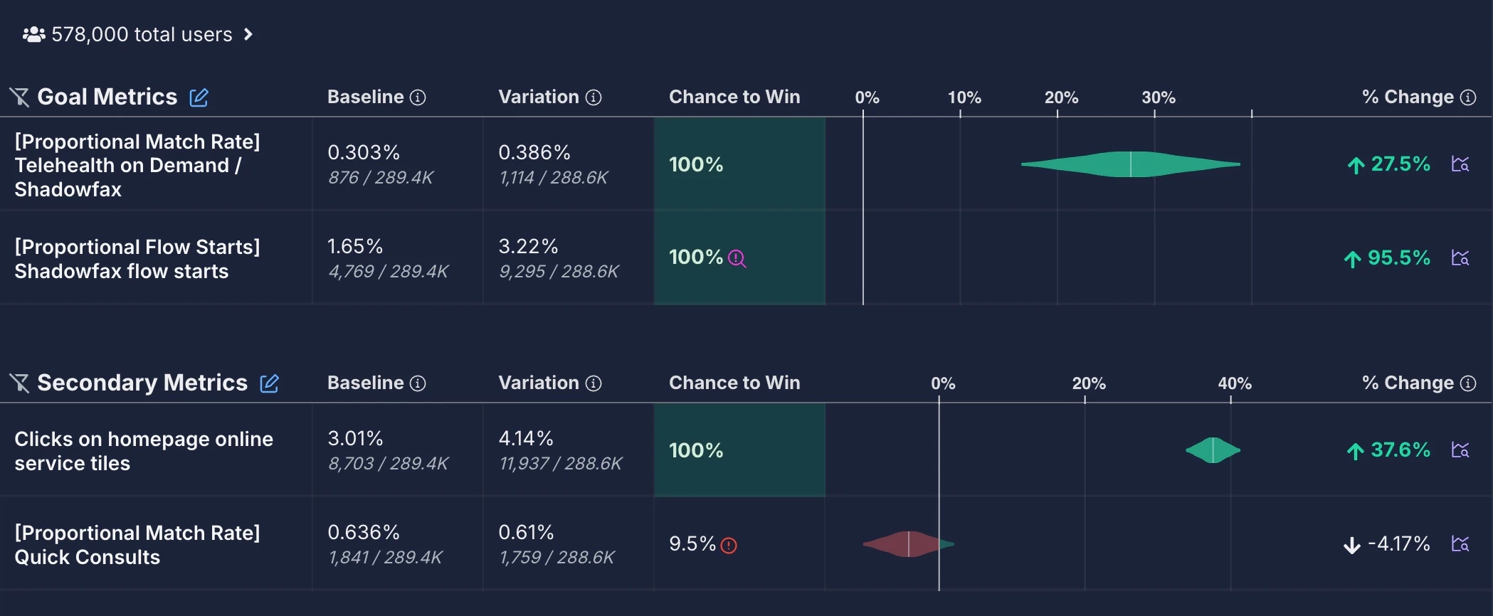
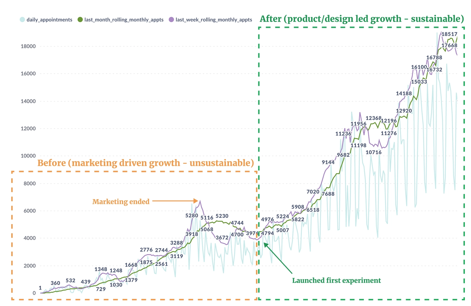
Before (marketing driven growth - unsustainable) versus after (product/design led growth - sustainable).
Reflection & Challenges
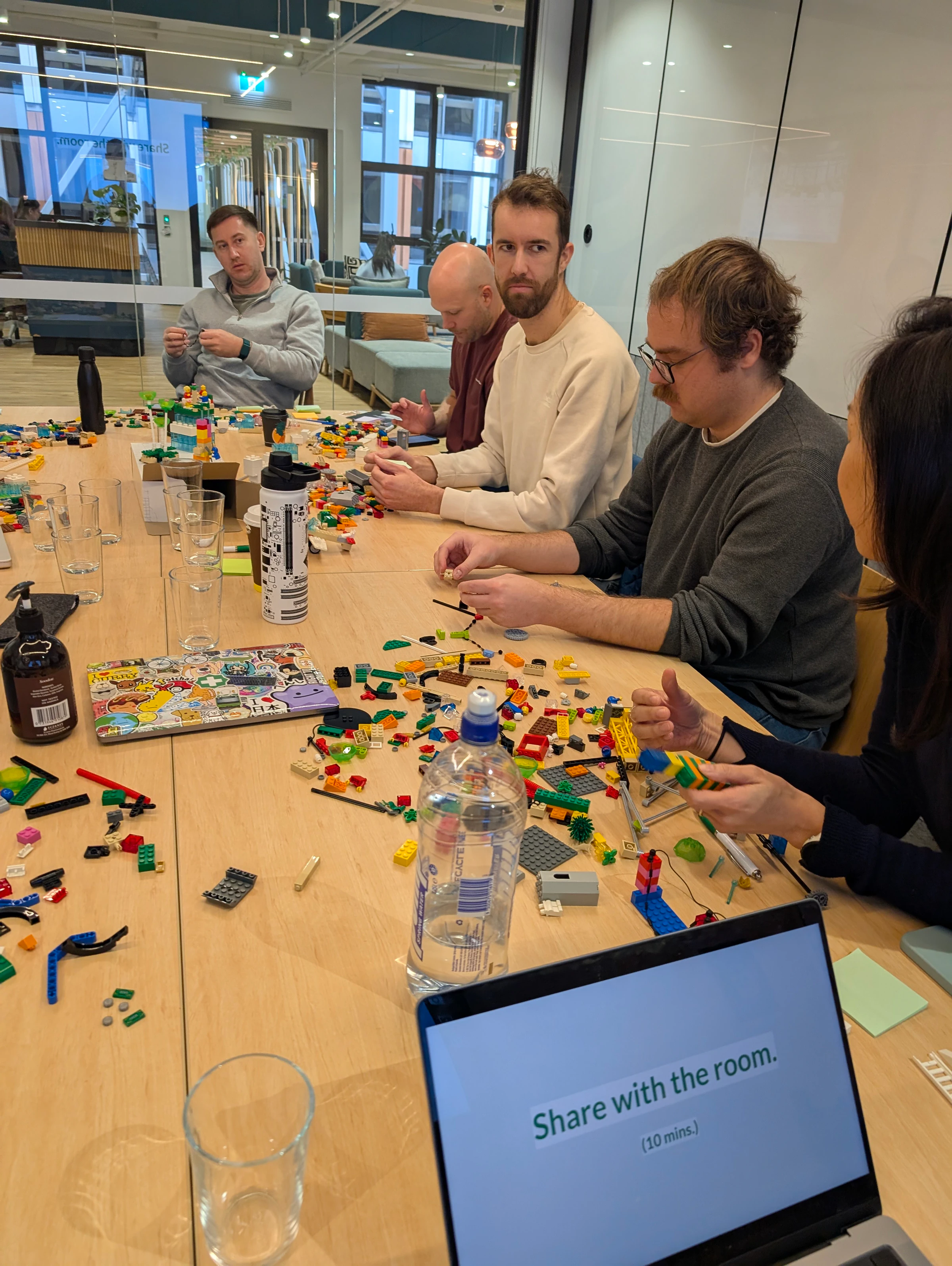
Team alignment was a constant challenge, especially the tension between ethics, healthcare and revenue. To work through it, I facilitated a 'Lego Serious Play' workshop to tackle serious problems in a playful, creative way. This format made it easier to discuss sensitive subjects like ethics in healthcare. Together we agreed on our values and goals and set design principles for the team, which kept us consistent and spared us from re-litigating the same lengthy debates.